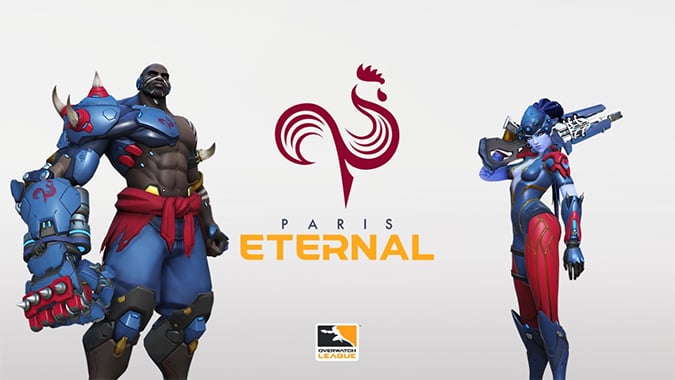
There’s more on a color wheel than black and red, Overwatch League.

The Paris Eternal unveiled their uniform colors for their team in the Overwatch League yesterday. This comes on the heels of the Toronto Defiant showing off their red and black colors which are precisely the same as Atlanta Reign’s colors. Five other teams are still working on their color scheme.
Now, I don’t play Overwatch. First person shooters cause my motion sickness to kick in big time, but I have been following the reveals for new 2019 teams. I’m a sucker for good color combinations and design. If you look around at any sports team, you’ll find usually a lot of thought went into what colors look good together. In the early days of major league baseball and professional football that wasn’t necessarily the case, but as expansion came, how a jersey, coffee mug, or lap throw looked became important and team colors have been adjusted to reflect the merchandising — the holy merchandising.
What do I make of Paris’ uniform colors? Well…people are already calling them the “Spiderman suit”. Obviously, they can’t use this. Disney (who owns Marvel, remember) would come after them big time. But can I say I’m tired of RED. Red. Red. Red. Two of the new teams are black and red. When I look over the field of team colors, what is with the stoplight red?
I’m not the only person noticing this. PCGamer complained about the color selection. Heroes Never Die‘s Cass Marshall interviewed Chris Overholdt about the Toronto Defiant. Cass brought up team colors.
How’s the reception to the announcement so far?
I don’t know, what do you think?
I actually like it. I would have liked pink, but the red and black is good.
It’s funny you should say pink, because we actually looked at pink. We looked at pink and tan, but we didn’t really feel it was bold enough for Defiant.
Wait…what? It depends upon the hue and saturation of the pink. Not strawberry milkshake pink, but if you chose a pink with fuschia overtones paired with a darker tan, that could have been very bold. Or scuttle the tan and go with cream. What about green and tan? Green and blue? Let’s ditch the actual primary and secondary colors and go with variants. Where’s the teal? Teal and silver. Maroon and silver. What about a chocolate brown and gold? Or navy and white? Go to a store and buy a box of 24 crayons. There’s more imagination in that box than in the colors of the OWL teams.
Seriously. All they had to do was talk to an art student or an interior decorator and get ideas for dynamic and — dare I suggest it — different color schemes to make their brands stand out. As it is, if you’re rooting for a team with red in their color scheme, you’ll be okay.
We do have hope, though, because the Ghangzhou Charge announced their colors last night: a light aqua and navy blue combo. While blue is also reaching high levels of saturation in the Overwatch League, we’ll take it.
Please consider supporting our Patreon!
Join the Discussion
Blizzard Watch is a safe space for all readers. By leaving comments on this site you agree to follow our commenting and community guidelines.
 @GimmletteMajor


