Hearthstone artists discuss the game’s unique approach to art design

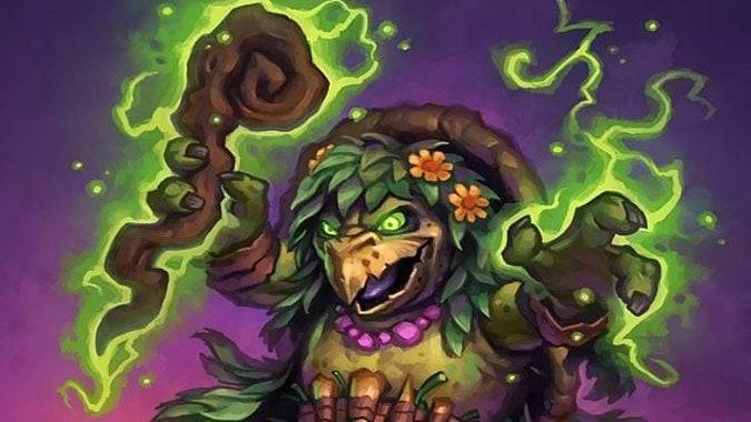
This weekend, a host of Hearthstone art folks hosted an AMA on Reddit, talking about how they work on the game and answering a bunch of other questions. The people from the game who took part are Art Director Ben Thompson, Outsource Art Manager Jeremy Cranford, FX Artist Hadidjah Chamberlin, and Concept Artists Jomaro Kindred and Jerry Mascho. What did they talk about? I’m glad you asked, because we’re going to look at some highlights from the AMA thread.
For me, it was interesting to read about how the Tortollans came to be, and in general how art and design work collaboratively on Hearthstone — sometimes the art team comes and says, “Hey, can they ride hippos?” and sometimes the Design team says, “Put him on a giant parrot.” There’s a bit of give and take in the process. Oh, and I also loved seeing King Krush’s animation played out as an answer. Truly, who doesn’t love a Devilsaur? No one.
There were also some interesting responses to the visual limitations of Hearthstone cards and how the frame for the on-board icon makes decisions in designing the art. Similarly, how the current engine for the game deals with 3D effects and the challenges of translating art from World of Warcraft to Hearthstone is a fascinating look at the complications of an art style such as Hearthstone’s.
That answer in particular is interesting to me because it makes a good point that people think of Hearthstone as automatically lighter in tone than WoW, but a lot of the art for the TCG is actually pretty dark — just take a look at Knights of the Frozen Throne and you’ll see some dark stuff. I also found it interesting to see that so much work from the FX team goes into stuff like simple deck openings. But it makes total sense when you think about it — there’s a lot happening when one of those packs gets opened.
If any thread in the AMA deserves your attention — and I’d argue they all do — this discussion of how the art team approached each expansion’s theme and how the art was used in service to that theme is definitely worth your time. Hearthstone has run the gamut from cool exploration to frozen undead horrors, and it’s gone from Gadgetzan to the Old Gods. In other words, there’s been a huge amount of variety in its visual design, and I loved seeing how those processes worked out.
You should head over and take a look at the AMA for yourself — Hearthstone fans, as well as people who just plain love Blizzard’s art design, will find a lot to think about in it.
Please consider supporting our Patreon!
Join the Discussion
Blizzard Watch is a safe space for all readers. By leaving comments on this site you agree to follow our commenting and community guidelines.
 @MatthewWRossi


