How Blizzard designed Hearthstone’s Tavern Brawl

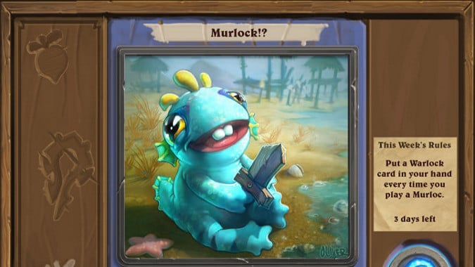
Art direction on a game like Hearthstone is extremely important, because it’s a game which consists of small pieces of art on a backdrop of art, ultimately. So this article from IGN where Ben Thompson (Hearthstone’s Art Director) goes through how they pieced together the new Tavern Brawl mode and how it would look is pretty interesting to me.
One point he made up front that I think bears repeating:
We have a user interface in Hearthstone that is very realistic and very physical, it’s not a window through which you view the world, like WoW or a lot of other games, the user interface is the whole game, so because of that, Derek gets involved at a much earlier stage and throughout more of the process than maybe he would on another game.
They lay out the process, moving from concept sketches through designing the UI to display information in a way specific to the new game mode to the finished product. It’s very interesting and it gets me thinking about how games like Hearthstone are a very different animal than, say Diablo 3.
They also go into detail on how the look of the interface developed both to present the proper information to players and also to display the proper aesthetic and give them a sense of how this experience will play out. Tavern Brawl changes up the rules, and they wanted the UI to make that clear from the start. Making it part and parcel of the altered gameplay with elements like a chalkboard and cork backing was a purely visual way to reinforce those changes.
It’s an interview that’s definitely worth reading.
Please consider supporting our Patreon!
Join the Discussion
Blizzard Watch is a safe space for all readers. By leaving comments on this site you agree to follow our commenting and community guidelines.
 @MatthewWRossi


