Diablo 4’s UI design update talks controllers and co-op and con feedback — oh my!

Welcome to 2020, Diablo 4 fans. We’re not even at the end of the March yet, and we already have our quarterly update — how cool is that! D4‘s Lead UI Designer Angela Del Priore dives into UI design, controller support, and co-op play.
Let’s check out what’s new and interesting in the D4 development world.
![]()
First on the radar is feedback from the BlizzCon 2019 demo. Now, our resident Diablo expert Matt Rossi queued up for the demo twice to try the Barbarian and Druid and spoke of the UI as an “evolution of Diablo 3.” Per the quarterly update, a lot of the feedback received revolved around inventory aesthetics. The feedback also informs our first bit of awesome news — different sized items will not be brought back in D4. No more inventory reorganization mid Nephalem Rift.
Item icons also get some love with reduced background brightness and saturation while still maintaining visual cues to indicate rarity. The dialed back intensity is complementary to the overall game style thus far. The adjustment means rarity is still evident but does not harken back to the oft-complained about cartoonishness of D3. The inventory screen itself also received some love, with adjustments to the layout to balance out the screen composition and improve ease of use.

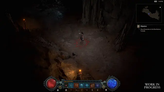
One of the more notable changes in the D4 UI was the shift of the action bar to the left corner, which opened up combat area visibility. Well, the devs are reversing that change…in a fashion. The default location for PC players will return to the center of the screen, but they will offer both positions (left and center) as options on the PC! This choice is a pretty unique shift as UI customization from the player perspective has not been an option. But this change ties into a more significant adjustment for the PC crowd as well… because controller support will be coming to the PC.
Yep, you read that correctly. The Diablo UI team has a unique opportunity due to the unique position of D4 being developed for both PC and console simultaneously. Del Priore states that they wanted to give players the ability to switch between the two options freely. Having the option for controller input impacts how the team approaches the UI, as the use flow changes based on the input device. Still, they are emphasizing that controller support should not be a limiting factor.
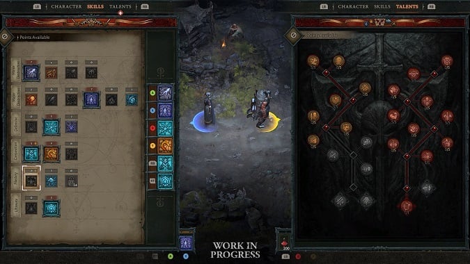
The final item in the UI update is pretty impressive, as it addresses the couch co-op UI. In my household, this is a perpetual point of contention; level-ups mean one, then the other, popping up the player UI to review skill runes or new skills. That extra time adds up! Eventually, you don’t want to mess with it anymore and shut down the game. Well, this is going to get some love — in the 2-player co-op experience, core progression UI screens (such as skill trees) can be opened independently or at the same time. The shared screenshot is looking pretty sharp, even for a work-in-progress.
I love these updates from the Blizzard team. It’s maintaining interest in the game and keeping the community involved as development occurs. I’m still impatient and want the game, oh, yesterday, but hearing how feedback is being taken and honestly considered is awesome for staying engaged.
But what change are you most excited about? Let us know in the comments!
Please consider supporting our Patreon!
Join the Discussion
Blizzard Watch is a safe space for all readers. By leaving comments on this site you agree to follow our commenting and community guidelines.
 @lizexmachina


