The patch 9.2 Warlock tier set makes some unfortunate design choices, and the latest update hasn’t fixed it
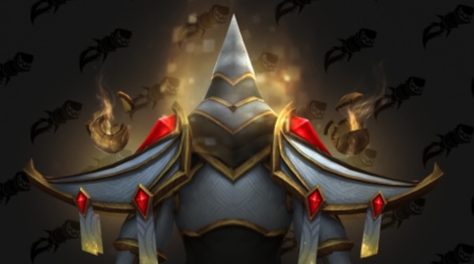
Back in mid-November, when we got the first preview for Patch 9.2, there was a lot of excitement around the idea that tier sets were returning for the Sepulcher of the First Ones raid. However, the Warlock set’s appearance looked… distinctive.
What do I mean by distinctive? Well, we could try and paint a picture with words, but in this case I think a simple image will suffice. It looked like this: a white conical hood.
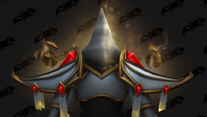
Talisen & Evitel described the hood’s KKK styling as “very unfortunate” and I’d have to agree.
When the community pointed out that this wasn’t a great look, the folks at Blizzard quickly agreed and said they were going to adjust it for future PTR builds. It was welcome news that the set would get a visual update.
We hear you and agree. This was an oversight where we hadn't yet fully reviewed this set from every angle before putting it into the initial test build. We've already begun work to adjust the set, and you'll see changes to it in a forthcoming build of the Eternity's End PTR. https://t.co/0ZxNgMlSXu
— WarcraftDevs (@WarcraftDevs) November 19, 2021
Now, I get that things often take a few passes to get to the goal, and also, I get that there’s a limit to how much that can feasibly be done once a patch has reached the PTR, as time has been spent designing and modeling these sets. I admire the effort to make the upcoming Shadowlands patch 9.2 Warlock tier set look less… bad and not in an aesthetic sense but rather in a this looks like a Klan hood sort of way.
But the changes to the set in the latest PTR build, which added a stripe to the hood, don’t do much to change the fact that it’s a white conical hood that hides the wearer’s face. It still really looks like a Klan hood.
I honestly don’t know if there’s a way to make a big white pointy hood not be reminiscent of that, but I have to say, I don’t think a stripe is going to manage it. Looking at the original, and then looking at the revamp, I find it extremely hard to not see it as adding a go-faster stripe to a white hood, which is… I mean, divorced of real world context, the set looks badass. But the legacy of the thing, which is easily found with a moment of Google searching, is hard — perhaps impossible — to shake.
A big pointy white hood that obscures your face is pretty much visual coding for a very specific kind of racist awful, and I just don’t know how you keep big pointy white hood and lose that context. Making it faster isn’t really the goal, but rather making it not look like a Klan hood — and the addition of a racing stripe hasn’t really managed that.
Honestly, either lose the big pointy hood, or lose the face plate and let us see the faces, and quite frankly I think ditching the big pointy hood is the best option. It looks cool. I’m sure it was a lot of effort to model. But it’s just not working, and I don’t think it can work.
Please consider supporting our Patreon!
Join the Discussion
Blizzard Watch is a safe space for all readers. By leaving comments on this site you agree to follow our commenting and community guidelines.
 @MatthewWRossi
