Images of Diablo 3 from Blizzard North’s original development show a much darker game — but that doesn’t mean it would’ve been better
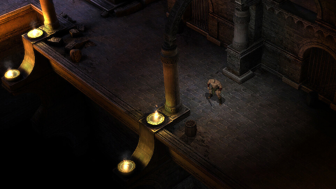
If Blizzard North, the original developers of the Diablo series, had completed their version of Diablo 3, it would have been a different game. That’s just fact — there’s no reason to dispute it. It would have been far closer in tone, scope, and art to the predecessor games in the series, both because it was being worked on by the same people as a direct continuation and because that was the preferred aesthetic of that studio. If you need proof of that, look no further than these early development screenshots of Diablo 3 from Oscar Cuesta, who was a Senior 3D Artist for Blizzard North during the game’s original development.
A lot more than aesthetic was different in 2005’s version of Diablo 3
It’s worth pointing out that Blizzard North was working on Diablo 3 back in the period of time prior to 2005 and the shuttering of the entire house. That means their version of the game, if it had come out at all, would have come out nearly six years before the version we got. In the CRPG field, a six-year gap is a big deal — resources, techniques, and the equipment all evolve over that time. A 2005 Diablo 3 would have looked and run differently than a 2012 Diablo 3 did.
I say all this because, when looking at these screenshots, I immediately have several thoughts. The first is that wow, this game would have looked a lot more like Diablo 2 than what we got in Diablo 3. It is indeed less colorful, although admittedly there are no mobs visible and nothing is exploding in a shower of gore, which tends to add some reds to this otherwise grey, muted art style. It’s hard to dispute what Kotaku had to say about them — this indeed would have been a much darker game in terms of what you could actually see.
The second thing I think is, “Wow, glad we dodged that bullet.”
Diablo 3’s use of lighter colors is arguably more effective
Okay, I’ll just say it — Diablo 2 looks like a butt. There’s a reason y’all keep clamoring for a remaster, and that’s because you can’t see a blasted thing in that game. A dark atmosphere is fine, but despite what anyone says, Diablo 3 as we got it isn’t a vibrantly colored game, it just uses some color so that we can actually tell things apart and see them clearly, which is nice when playing a video game. Brooding and atmospheric darkness is great, but when you literally can’t tell the monsters apart from the background it gets old pretty fast, especially in an Action RPG where you’re supposed to smash things for loot.
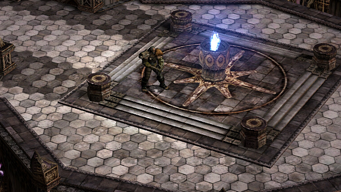
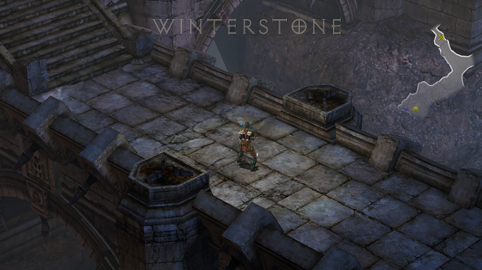
Furthermore, looking at a lot of these screenshots, they’re not even darker. There’s a lot of washed out, light grey that’s just kind of there. There’s some absolutely gorgeous scenery in them — I particularly like the Whitestone picture, and there’s a floor mosaic that’s got some nice detail — but it’s not dark at all. That is very brightly lit, just brightly lit with no real color variations to speak of. Even when one of the images is darker, it doesn’t feel substantially different from Diablo 3, in my opinion.
None of this is bad work. For 2005, it’s pretty impressive. But it’s hardly making me lament that we didn’t get Diablo 3 earlier than we did — there’s nothing here that I prefer to, say, Westmarch or Caldeum. I’m aware that everyone’s opinion is variable and for some people looking at this, these images fit the Diablo 3 they always wanted. But for me? I’m not exactly losing sleep over the decision to include more varied settings to play Diablo in that Diablo 3 ended up embracing.
Different, darker, and bloodier takes
A recent post on Reddit focused on the work of Tim Tao, who not only did 3d modeling for the original version of Diablo 3, but he also did concept art for what appears to be the battleground around what might be Bastion’s Keep (or its predecessor, Winterstone) and even some of the original version of Heaven. It’s clearly a much different aesthetic, and while I’m a little sad we didn’t get the really far more aggressively grim and terrifying version of the trenches — Bastion’s Keep and the area between it and the ruined Mount Arreat in the released version of Diablo 3 absolutely do have a bit of this same feeling, but this version is a lot more aggressive and disturbing.
However, I’m frankly more of a fan of the Heaven we got in the release version of Diablo 3. This one is pretty unremarkable, it’s grey stone and dark angles. It’s just not very Heaven-y, you could say. It feels mundane, while the trench sequences we see on Tim Tao’s page are a lot more disturbing and evocative.
Darkness or light to tell the right story
Darkness purely for darkness’ sake does not work, and interestingly, I believe Diablo 2 knew that — the darkness in that game was an objective correlative to the increasing darkness of Sanctuary itself as the Three Evils came closer to their goal, as Diablo’s march across Sanctuary reached its goal. If Blizzard North had made Diablo 3, they may well have made a game that also relied on that kind of visual storytelling and it may have worked a treat. I’m not opposed to that, and it may well make a comeback in Diablo 4.
But Diablo 3 as we got it chose to use a more expansive color palette and more “sunlit horror” to tell a story about how corruption hides below the surface, using it as an objective correlative to the world we were exploring, and it worked for that game. Looking at these images, I’m more curious than I was about what Blizzard North’s ideas were for the story, but I don’t at all prefer these images to what we actually got. They’re excellent work — I don’t blame Oscar Cuesta for wanting to show them off. But they also convince me that Diablo 3 was heading in the direction it went anyway, that more light was always going to be part of the game.
Please consider supporting our Patreon!
Join the Discussion
Blizzard Watch is a safe space for all readers. By leaving comments on this site you agree to follow our commenting and community guidelines.